Collateral

Every piece plays a part.

Good marketing is something more than the sum of its parts, but those parts are still critical. Here's a selection of some smaller items I've held onto over the years, for whatever reason - primarily my own sentiment for them.

White version of Pantages room card Red version of Pantages room card Black version of Pantages room card

Pantages Room Cards

At the time, Plantages was exploring ideas on how to reinvent its brand with a cohesive theme. These cards were made as part of the theatre and festival package, to replace the mundane cards that were simply the hotel logo on white. There's no functional difference between the designs - guests may be issued any of the three, and we hope to capitalize on guests taking the card with them as a souvenir when they leave.

Supplementary Branding

Skyline has a lot of smaller assets that require branding. Items like restaurants and other faculties at the properties, clubs and memberships, or the Skylife magazine that we use to populate the lobbies. These assets are varied and require their own touch of character.

Rendering of Designopolis brochure

Designopolis9

Designopolis was an annual event held to help get new designer names out there where potential employers could pick them up. I handled the bulk of the design work going into the promotions of the event, with the notable exception of the wordmark Designopolis9 (which was handled by a colleague). The send outs below were designed to fit in a square CD sleeve for mailing.

13° Wine Bar

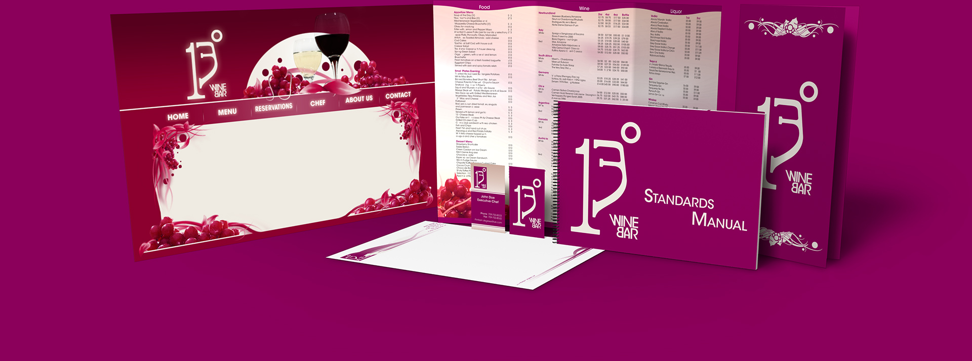
13° was actually a college project, not a proper contract. It was nonetheless set to be an actual business. As part of our senior year, the visual design and marketing program collaborated with the business program to let both student bodies cut their teeth on client-designer relations. The group that brought me aboard had envisioned a wine tasting restaurant in downtown St. John’s, Newfoundland and needed a full set of brand assets for the project. The logo plays on the character glyphs in a manner reminiscent of a wine glass silhouette, and the brand colours consist of a magenta-red and bone white channeling red and white wine respectively. Unfortunately, the plot of land the restaurant was hoping to claim was bought out and 13° never came to be. Still, I like to hold onto the assets developed for them as it was my first real experience with a clientèle environment.

Collection of various items made for the 13 Degrees wine bar

Terraforming

This was a personal project, for the sake of brushing up on my video production and 3D visual skill sets. Shown above are the Moon, Venus and Mars rendered as they exist today and rendered as if they had been terraformed with Earth-like habitability. The centerpiece of this project are the videos for each planet, with the individual passes rendered in Softimage (these videos are quite old) and compiled in After Effects.

Brand Revitalization

A pair of Ontario's major resorts were overdue for a fresh update for their brands. Both brands carry considreable equity that needed to be preserved and rejuvinated with cleaned up image assets and new brand guidelines. This is indeed new artwork for both, as the existing logos were originally vector scans of their older, pre-digital mediums, and new colours for both nailed down with Pantone master swatches.